

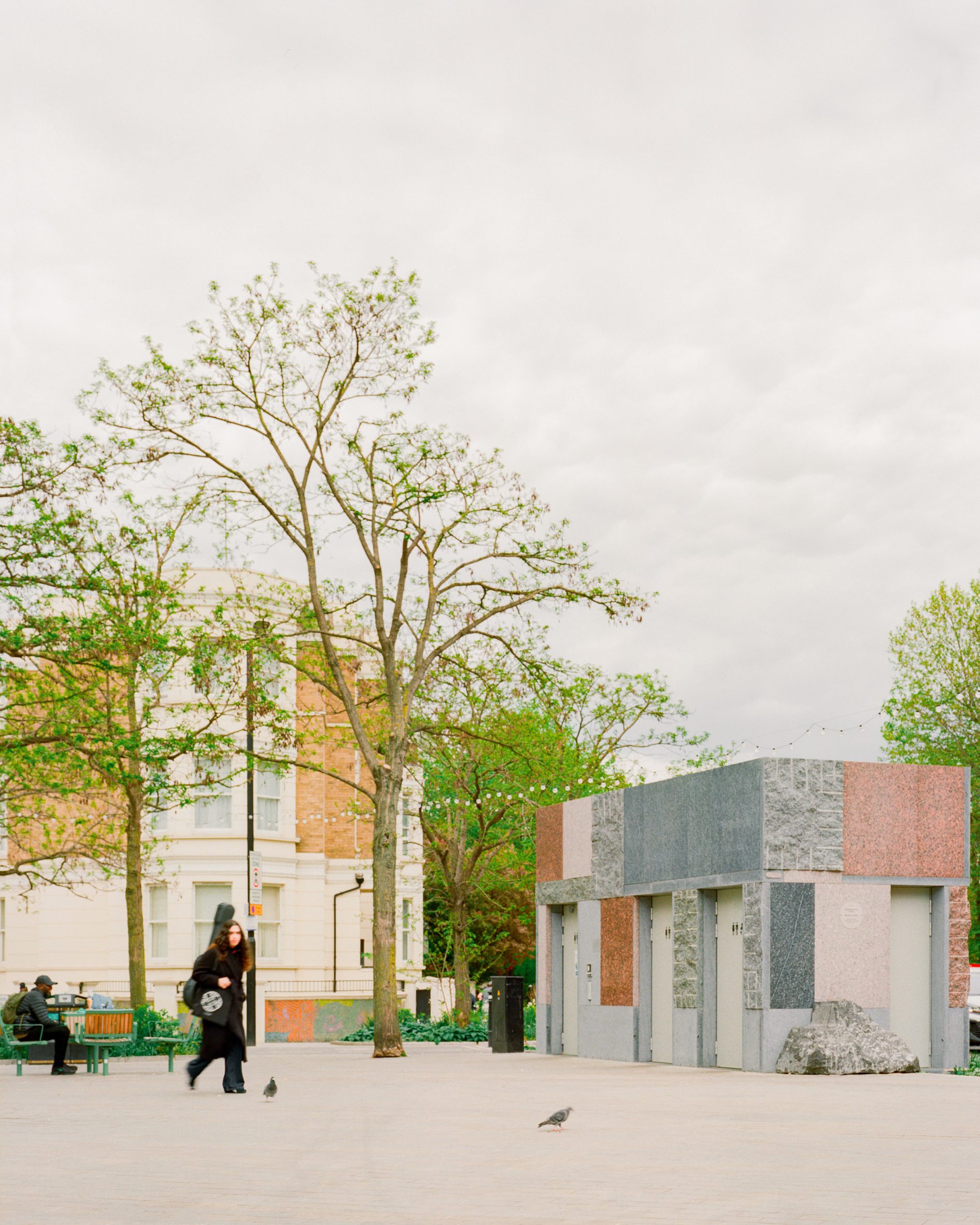
In this week’s comments update, readers are discussing a public toilet block created by Studio Weave in London.
Using stone salvaged from a demolished office building, the structure replaces an underground toilet block in the Maida Hill area, which had issues with accessibility and antisocial behaviour.
“Modest and meaningful. Bravo”
Readers were split over the public toilet’s patchwork-like facade.
“I really appreciate the quilt-like mixing and matching of colours and textures,” wrote Eric. “I also like the careful detailing of the interlocking parts, nice work!”
Architect Incognito agreed, saying, “The effect to me resembles a tapestry with a nice tension between the informal variance of colours and textures and the heaviness of the stone.”
“Modest and meaningful,” wrote Jbmoses. “Bravo.”
Other commenters weren’t so convinced by the design.
“[I] like the idea but why did they have to use such disparate stone types? A bit ugly to me,” questioned Flvs.
“I would hate to see that ugly thing anywhere,” said Tom Roberts.
Djbethell was similarly scathing. “What an ugly box, and what dreadful colours,” he wrote. “It’s screaming out for graffiti.”
To this, American Tinker asked, “Canvas for a Banksy?”
What do you think? Join the discussion ›
“YAY! Art is fun again!”
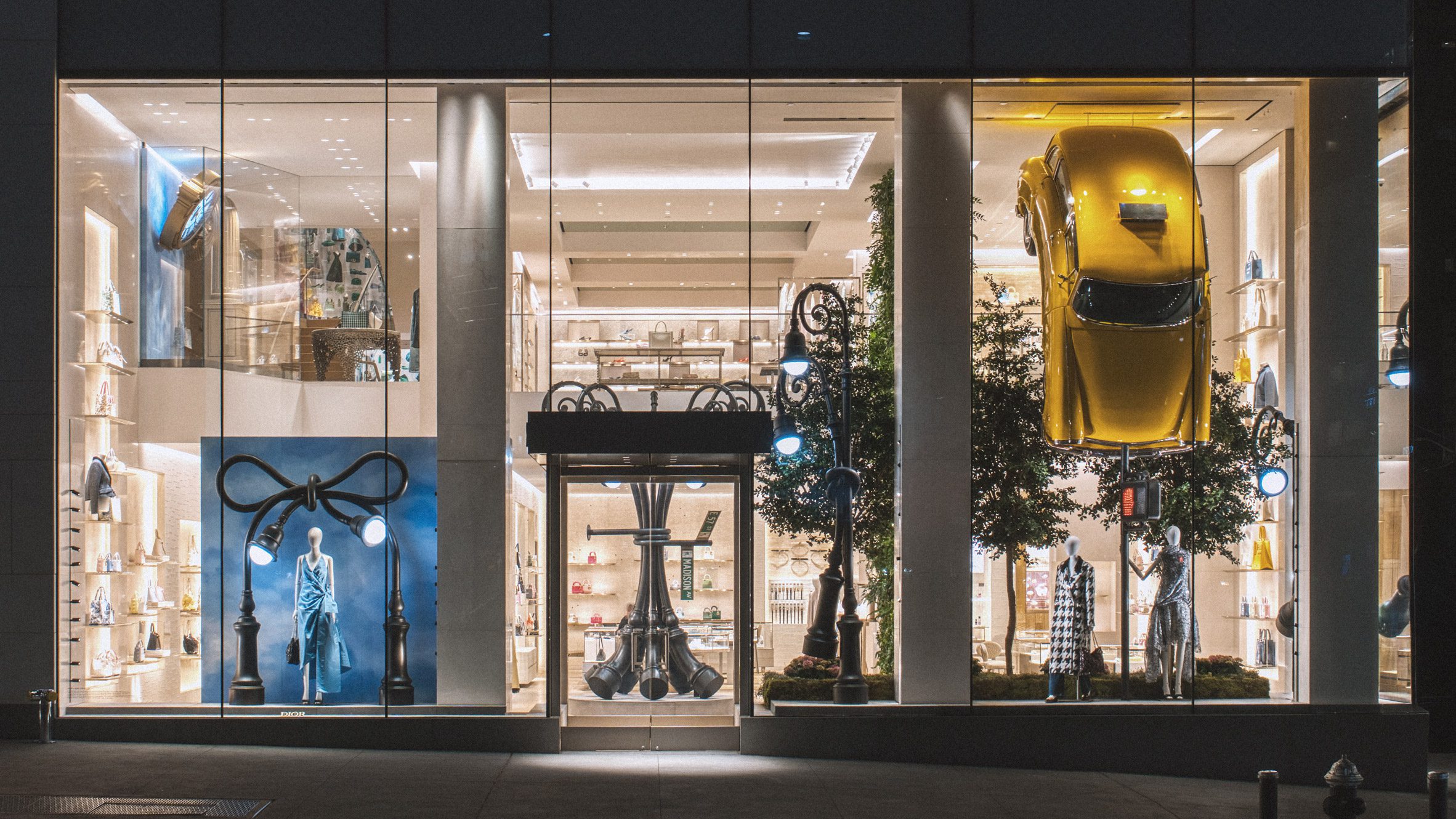
Another story causing a stir in the comments section this week was the surreal window displays designed by artist Alex Chinneck for Dior stores in New York and Los Angeles.
“Mostly tacky, tasteless and exhibitionistic,” wrote Tom Roberts. “So much for the guise of elegance and quality that the brand is proposing to express.”
Pa Varreon was just as incensed. “Plastic and superficial – in other words a kind of vulgar commercialism,” he said. “It is not at all in the branding spirit of Dior.”
“Rich people are so weird,” added reader Deep State.
But the displays had just as many admirers as detractors.
“Great fun, I’d buy something there,” wrote Lawrence Janus, expressing interest.
Design Junkie agreed, saying, “Amazing. Crazy amount of work.”
“YAY! Art is fun again!” said T Foxe with energetic relief.
Have you had your say? Join the discussion ›
“This is a feast for the eye!”
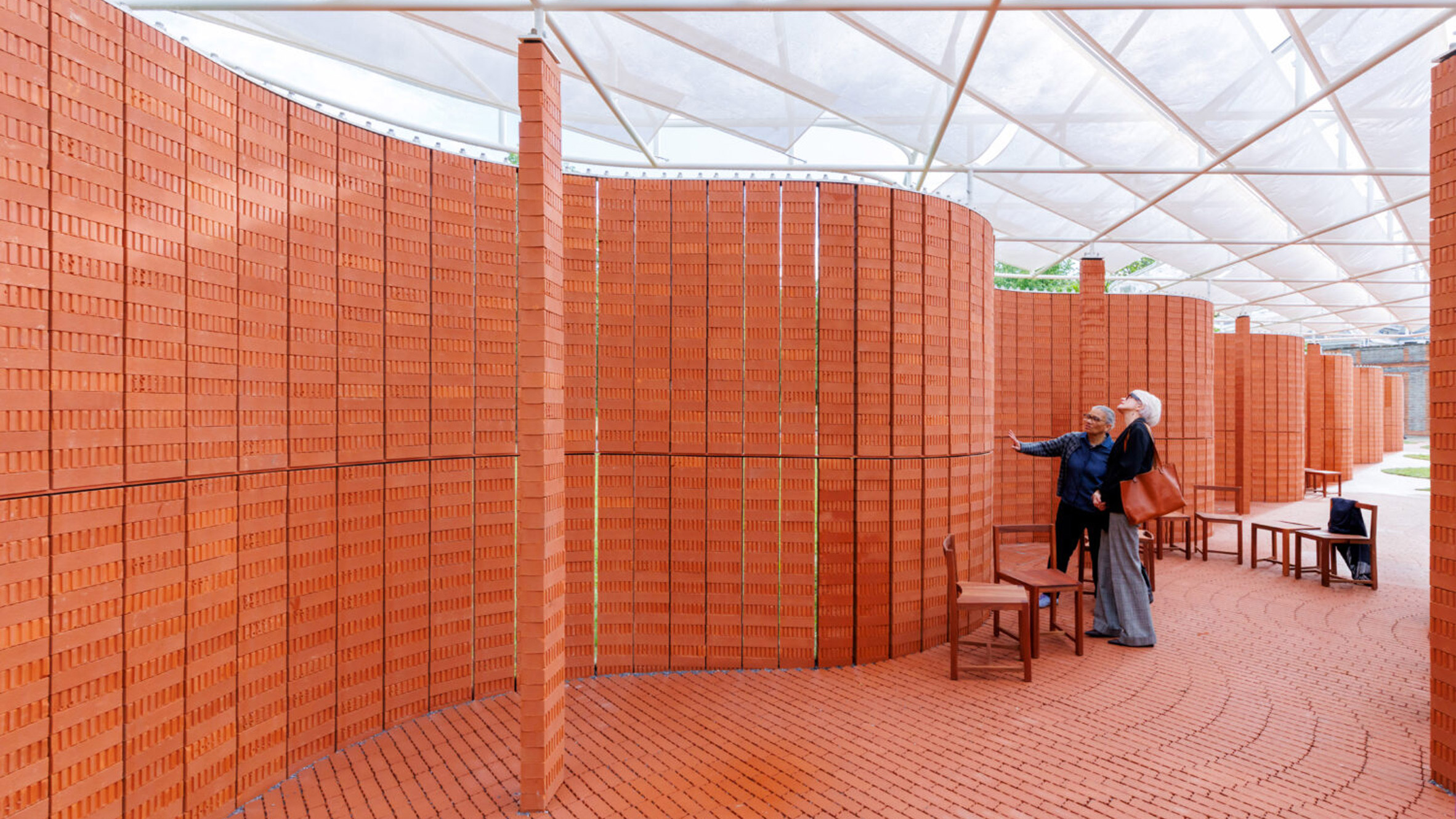
Readers were also engaging with the 25th edition of the Serpentine Pavilion in London, designed by Lanza Atelier to reference a traditional English crinkle-crankle brick wall.
“Interesting, but not one of my favourite pavilions,” wrote Brett S.
David Mitch was even less impressed. “This looks like the most boring pavilion to date,” he said.
Despite this, most commenters were supportive of the design.
“Very beautiful,” wrote Sorperdida. “This is a feast for the eye!”
“Intriguing. It appears to be very rich across a variety of spectra – definitive textures and rich coloration, the movement of light across the day, sound must be interesting as well,” said JZ.
Miller Matlock praised the studio. “Really appreciate the effort to tie British history into the pavilion, reinterpreted into a contemporary Mexican form,” he said.
What’s your take? Join the discussion ›
Comments update
Dezeen is the world’s most commented architecture and design magazine, receiving thousands of comments each month from readers. Keep up to date on the latest discussions on our comments page and subscribe to our weekly Debate newsletter, where we feature the best reader comments from stories in the last seven days.
The post “Canvas for a Banksy?” says commenter appeared first on Dezeen.


